Linked In – I’m Doing It Wrong
So the other day I noticed that you could make a map of all your Linked In contacts, which shows you where you have clusters of contacts and where the clusters connect. Naturally, because I love visualizations of data, I jumped on it. And this is what I got:
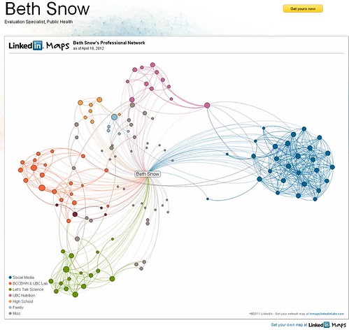
The first thing you notice is the giant cluster of blue on the right. That’s my social media contacts. Now, remember that I don’t work in social media – those are strictly social contacts. And remember also that Linked In is supposed to be the social network for work contacts. I also don’t work at UBC or in science outreach, yet they represent my other big clusters. Hell, there are even little clusters of my high school friends and my family members! The orange cluster on the left is really the one closest to my work, but it’s a mix of contacts from my former workplace and the lab I worked in during my PhD (there was crossover between these two groups, hence the mishmash). The two places one would actually expect me to have clusters from on a supposed work-related social network – my actual workplace and my MBA program – are nowhere to be seen! I am totally failing at Linked In!
So I may have sent 85 invites to people to join my network. Granted, many of these are still not work-related, as I added my Gmail contact list and then checked “invite” to anyone whose name I actually recognized from said list, but it’s a start. Next up, actually searching for work and school contacts!
Comments |2|
Tags: data, failing at the Internet, Geekery, Linked In, Nerdery, networking, social media
Appropriately, us blue nerds are off in the corner.
LOVE IT! Off to map mine now!